Widescreen Grade: B
Ultra-Widescreen Grade: Incomplete
Multi-monitor Grade: B
4k Grade: Incomplete
Read Full Detailed Report - Trine
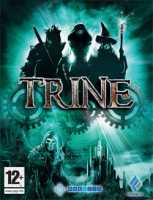
Platform/puzzle game by Frozenbyte. Reminds a lot of The Lost Vikings.
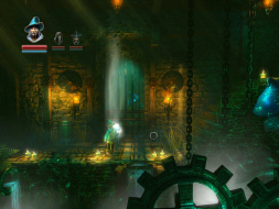
4:3
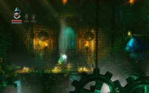
16:10
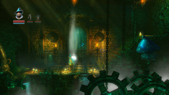
16:9

3x1
| Widescreen Gaming Forum http://www.wsgf.org/phpBB3/ |
|
| Trine http://www.wsgf.org/phpBB3/viewtopic.php?f=61&t=17603 |
Page 1 of 3 |
| Author: | X-Warrior [ 04 Jul 2009, 11:38 ] |
| Post subject: | Trine |
 Widescreen Grade: B Ultra-Widescreen Grade: Incomplete Multi-monitor Grade: B 4k Grade: Incomplete Read Full Detailed Report - Trine Platform/puzzle game by Frozenbyte. Reminds a lot of The Lost Vikings.  4:3  16:10  16:9  3x1 |
|
| Author: | g00seberry [ 04 Jul 2009, 11:55 ] |
| Post subject: | Trine: Detailed Report |
For custom res ... You must edit the options.txt file located at C:Program Files (x86)NobilisTrine Demo (GamesPlanet)config Find under Display (lines 85 & 86) Code: screen_height = 1080
screen_width = 1920 Change the numbers to your desired resolution. The resolution box in the game launcher will now appear blank. Simply leave it as it is and launch the game. |
|
| Author: | X-Warrior [ 04 Jul 2009, 12:07 ] |
| Post subject: | Trine: Detailed Report |
Thanks, I've pasted your post in the report :) |
|
| Author: | dopefish [ 04 Jul 2009, 14:53 ] |
| Post subject: | Trine: Detailed Report |
X, see my thread here: http://www.widescreengamingforum.com/node/10753 It contains more information on the interface and gameplay. The loading screen is actually squished for 16:10 and 4:3, but right for 16:9. The same for the main menu, as well. The game itself is hor- if less than 16:9 and hor+ if greater than 16:9. Aside from that, I was able to choose 1280x720 and 1440x900 both worked fine windowed and fullscreen. I am using Windows 7 RC, though. |
|
| Author: | X-Warrior [ 04 Jul 2009, 15:05 ] |
| Post subject: | Trine: Detailed Report |
Updated to include a link to your thread :) |
|
| Author: | The_cranky_hermit [ 06 Jul 2009, 01:22 ] |
| Post subject: | Trine: Detailed Report |
I can confirm that the bolded resolutions all work. Also, 1280x768 works with the .ini fix. So does surround, which is hor +. 

Since the loading screen is relevant, its stretching is a blemish. Also, the cursor definitely stretches in widescreen. Another blemish. Calculated grade: B .ini solution, stretched loading screen, and stretched cursor are blemishes. |
|
| Author: | dopefish [ 06 Jul 2009, 02:58 ] |
| Post subject: | Trine: Detailed Report |
Yeah, even though it's easy to see 16:9 is the default/native, the cursor still stretches, but that doesn't really get in the way much. It looks like the HUD elements (The character picture/health bar) stretch in TH and 16:10, while they do not in 16:9 or 4:3. |
|
| Author: | The_cranky_hermit [ 06 Jul 2009, 04:15 ] |
| Post subject: | Trine: Detailed Report |
A title screen that looks best in 16:9 doesn't make for a very strong case that the whole game is 16:9 "native." The gameplay for instance works fine at 4:3 - widescreen is just an extension of that. And in addition to the cursor only looking right in 4:3, the inventory screens certainly do not suggest a "native" 16:9 design either. |
|
| Author: | dopefish [ 06 Jul 2009, 06:57 ] |
| Post subject: | Trine: Detailed Report |
The fact that the title screen, loading screen, cutscenes, etc. look correct in 16:9 are a huge case. Considering 4:3 doesn't look right and that's a massive part of the game, considering it's one of the first things you see. The inventory is just centered so as to make it easy for 4:3 and anything wider to work fine. There's far more things that point to the game being designed for 16:9 than not. I know you're old and unwilling to accept change, but one of these days you're going to have to open your eyes and realize that not everything is 4:3. That kind of died a couple years ago when Xbox 360 games started getting ported over to the PC and everything being 16:9. Sure, some games are still designed purely for 4:3, but it's extremely rare nowadays. Almost everyone has widescreen, especially developers. |
|
| Author: | The_cranky_hermit [ 06 Jul 2009, 16:40 ] |
| Post subject: | Trine: Detailed Report |
The fact that the title screen, loading screen, cutscenes, etc. look correct in 16:9 are a huge case. The title screen is a small thing, as is the cursor and inventory screen. The loading screen, how do you know it's "correct" in 16:9? It shows just as much in 16:10 as it does in 16:9, only it's not stretched out as much. And the cut-scenes mean nothing. There are SCADS of games out there that use 16:9 cut-scenes. 4:3 doesn't look right How? Aside from the title screen, which is quite a tiny part of the game (no, coming first does NOT make the title screen a "massive" part of the game), how does 4:3 not look right? one of these days you're going to have to open your eyes and realize that not everything is 4:3. I'm aware that not everything is 4:3. I've been aware of this since Condemned: Criminal Origins. When it's clear that a game uses 16:9 as a baseline, I accept that. You have not proven that Trine is an example of such a game beyond the insignificant title screen. It's entirely possible that due to a lack of communication, an artist made a title screen in 16:9 but the programmers assumed it would be 4:3 and programmed the title screen to scale accordingly, which is a more plausible explanation than asserting that a title screen proves the entire game revolves around 16:9. Sure, some games are still designed purely for 4:3, but it's extremely rare nowadays. Games that work fine in 4:3 but work even better in widescreen, on the other hand, are not rare at all. |
|
| Page 1 of 3 | All times are UTC [ DST ] |
| Powered by phpBB® Forum Software © phpBB Group http://www.phpbb.com/ |
|